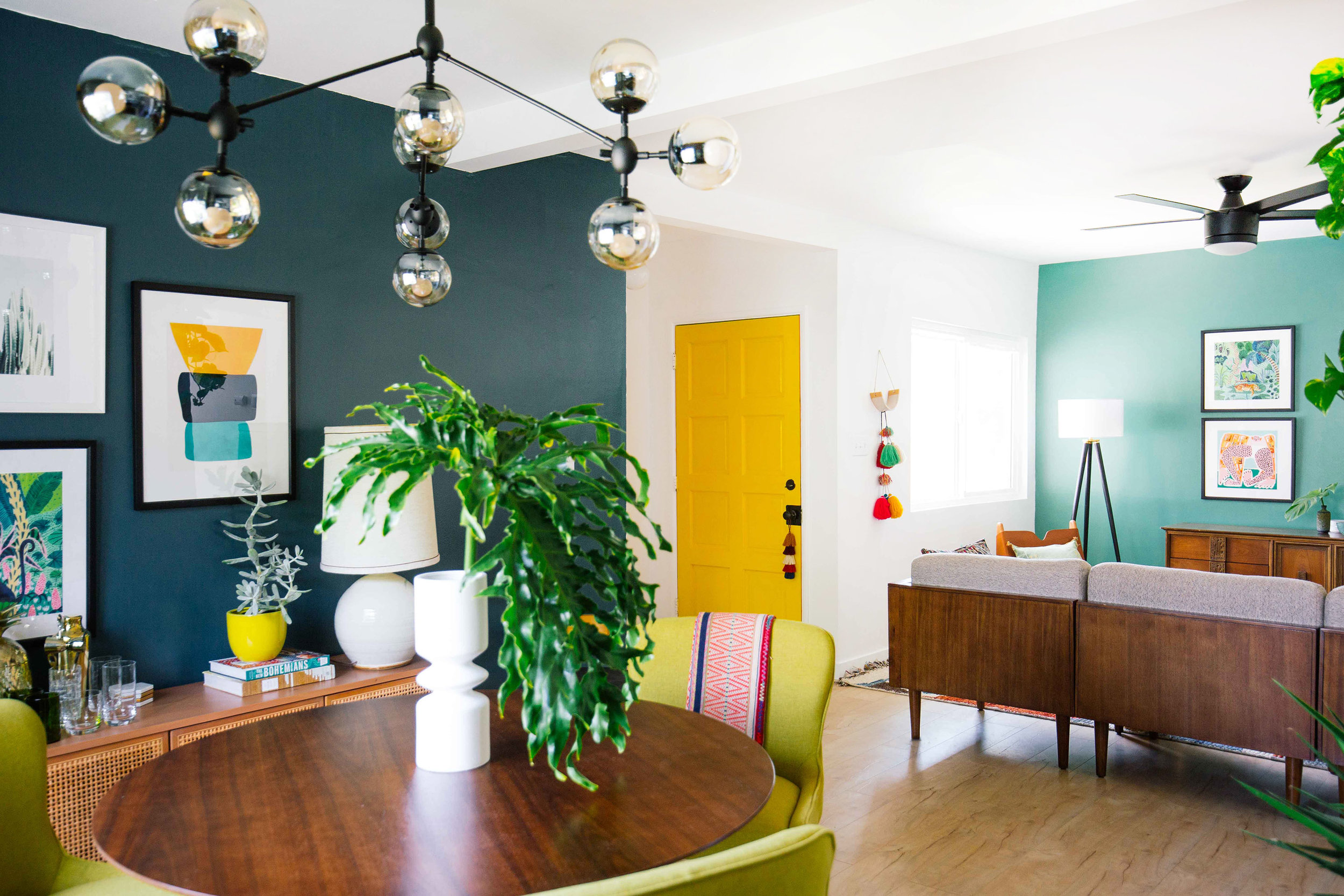
Imagine stepping into a home where each space flows effortlessly into the next, bathed in a symphony of colors that enhance the open layout without feeling overwhelming. This is the magic of choosing the right paint colors for an open floor plan – a design choice that can either amplify the spaciousness or create a chaotic visual jumble.

Image: gambr.co
An open floor plan, by its very nature, invites a sense of interconnectedness, blurring the lines between living, dining, and kitchen areas. Choosing the paint colors for such a layout demands a thoughtful approach. They should harmonize to create a unified and inviting atmosphere while preserving the individuality of each zone. This article will be your guide, exploring the best paint colors for open floor plans, delving into the psychology of color, and offering expert tips to create a home that feels both spacious and stylish.
Creating Flow with Coordinated Hues
Before we dive into specific colors, understanding the concept of flow is essential. In an open floor plan, the visual flow is crucial for a harmonious feel. Imagine a river gracefully winding through a landscape. Just as the river’s current guides the eye, carefully chosen paint colors can lead the gaze across different zones, creating a feeling of connectedness.
The Power of Neutrals
Neutrals are the cornerstone of creating flow in an open floor plan. They act as a canvas, providing a sense of calm and allowing other elements, like furniture and artwork, to take center stage. The most popular neutrals for open plan living include:
-
Off-White: This versatile hue offers a classic and timeless appeal, reflecting light and creating a sense of spaciousness.
-
Cream: With its warm undertones, cream adds a touch of coziness to the overall feel.
-
Gray: A modern and sophisticated choice, gray can lend a calming yet elegant air to the space. Consider cool grays for a more contemporary vibe and warmer grays for a traditional feel.
-
Beige: Beige evokes a sense of warmth and comfort, blending effortlessly into various design styles.
Embrace a Color Palette
While neutrals provide the foundation, you can add depth and personality to your open plan with a carefully curated color palette. Think of this palette as a theme that connects the different zones subtly. Here, we explore some popular color palette approaches:
-
Monochromatic Palette: This classic approach relies on various shades of a single hue. For instance, a deep blue in the living room could transition to a lighter sky blue in the dining area, creating a sense of continuity.
-
Analogous Palette: Analogous colors sit next to each other on the color wheel, creating a harmonious and visually appealing combination. This palette could combine shades of blue, green, and yellow or red, orange, and yellow.
-
Complementary Palette: Complementaries are colors that are opposite each other on the color wheel, like blue and orange or red and green. These combinations offer high contrast and visual excitement. However, use them sparingly to avoid overwhelming the space.

Image: ar.inspiredpencil.com
Using Color to Define Zones
While maintaining flow, it’s essential to define the distinct areas within an open floor plan. Different paint colors can subtly delineate spaces without creating physical barriers.
The Art of Accenting
An accent wall is a powerful tool for zoning in an open floor plan. Choose a richer shade within your color palette to create visual separation. For instance, in a living room with mostly neutral tones, a deep teal accent wall behind the couch can define the seating area.
The Power of Tone
Variations in the lightness or darkness of a color can also help to differentiate zones. For example, use a slightly deeper shade of gray in the dining area than in the adjacent living room to visually separate the space without stark contrasts.
Emotional Connection: The Psychology of Color
Choosing the best paint colors for an open floor plan goes beyond aesthetics. The colors you select can significantly impact your mood and how you experience the space. Here’s a glimpse into the psychology of color:
-
Warm Colors: Warm colors like reds, oranges, and yellows are associated with energy, excitement, and warmth. They can stimulate conversation and create a welcoming ambiance.
-
Cool Colors: Cool colors like blues, greens, and purples evoke calmness, serenity, and relaxation. They are ideal for creating a tranquil atmosphere.
-
Neutral Colors: Neutral colors like white, gray, and beige create a sense of balance and spaciousness. They work well for creating a clean and modern aesthetic.
Expert Insights and Actionable Tips
-
Consider Natural Light: The direction and intensity of natural light influence how colors appear. Colors that appear vibrant in a south-facing room may look washed out in a north-facing room. Consult a color chart in your space to see how shades behave under your existing light conditions.
-
Reflect Your Lifestyle: If you lead a busy life, opt for calming colors that promote relaxation. If you like to entertain, consider using warm tones that spark conversation and energy.
-
Test Before You Commit: Always test paint samples on your walls before committing to a full wall. Colors can change dramatically depending on the surrounding environment and lighting.
Best Paint Colors For Open Floor Plan
https://youtube.com/watch?v=lJHsA42OJdU
Conclusion
Choosing the best paint colors for an open floor plan can be both exciting and challenging. Remember, the goal is to create a space that feels both harmonious and personalized. By understanding the principles of flow, utilizing color palettes, and considering the psychology of color, you can transform your open floor plan into a vibrant and welcoming haven that reflects your unique style. So, grab your paint swatches, embrace the process, and let your creativity flow!


/GettyImages-173599369-58ad68f83df78c345b829dfc.jpg?w=740&resize=740,414&ssl=1)


