Have you ever designed a presentation with vibrant colors only to find someone in the audience couldn’t differentiate them? Or perhaps you’ve chosen a captivating color scheme for your website, unaware that it might be inaccessible to a significant portion of your visitors? Color blindness, a condition affecting millions, can make certain color combinations indistinguishable, creating confusion and frustration. Recognizing and respecting these differences is crucial for achieving inclusive design, ensuring everyone can enjoy and interact with our work.

Image: eliseyiis.blogspot.com
This guide delves into the fascinating world of color blindness, unraveling the science behind it and highlighting the importance of choosing color palettes that are accessible to all. We’ll equip you with the knowledge and tools to create inclusive designs that resonate with a wider audience. Let’s embark on this journey of understanding and empathy, to ensure everyone perceives the beauty of color in its full glory.
Understanding Color Blindness: A Spectrum of Perception
Color blindness, often referred to as color vision deficiency, is a genetic condition that affects how individuals perceive colors. It’s not about being “blind” to all colors; instead, it’s about a variation in the way certain colors are perceived. Unlike most other senses, our perception of color relies on complex interactions between light and specialized cells within our eyes.
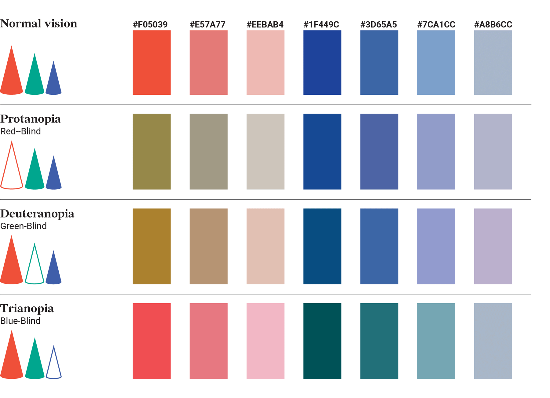
The most common form of color blindness is red-green color blindness, where individuals struggle to discern shades of red and green. This is due to a deficiency in certain light-sensitive cones within the retina, responsible for detecting these specific colors. Other forms, such as blue-yellow color blindness, are less common but can still significantly impact daily life.
Why It Matters: Color Choices Impact Accessibility
In a world saturated with visual information, choosing the right colors is paramount for effective communication and design. However, the way we experience color is not universal. Choosing colors without considering color blindness can lead to several accessibility issues:
- Confusion and Misinterpretation: Color-blind individuals might misinterpret crucial information conveyed through color, leading to confusion and potentially incorrect decisions. Imagine a traffic light with red and green appearing similar – this could have dangerous consequences.
- Exclusion and Frustration: When websites or designs are inaccessible to color-blind individuals, it can create a sense of exclusion and frustration. This can be amplified when navigating websites, interpreting data visualizations, or engaging with digital products.
- Loss of Information: Colors play a vital role in conveying information and highlighting key elements. If a color-blind individual cannot discern these colors, valuable information can be lost, impacting their understanding and experience.
Colors to Avoid for Color Blind Individuals
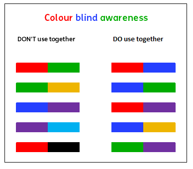
While there are no colors that are universally “bad” for everyone with color blindness, certain color combinations pose significant challenges for those with red-green color blindness, the most prevalent form. Here’s a breakdown of problematic color combinations and why:
- Red and Green: These are the classic culprits for color blindness challenges. Since individuals with red-green color blindness struggle to differentiate shades of red and green, using these colors together can lead to confusion. For instance, a red traffic light might appear yellow or orange, creating a safety hazard.
- Blue and Purple: While not as pronounced as red and green, blue and purple can also present difficulties for some with red-green color blindness, especially when the shades are similar. This can impact the readability of text, particularly when used for contrasting elements or backgrounds.
- Orange and Brown: These colors can appear similar to individuals with red-green color blindness, making it difficult to distinguish between them. This can pose problems when using these colors for visual elements like buttons, icons, or data points.
- Yellow and Green: Similar to orange and brown, yellow and green can be challenging to discern for individuals with red-green color blindness. If used together for text or visuals, it can create legibility issues, affecting the ease of navigation or information comprehension.

Image: www.datylon.com
Beyond Color Combinations: A Holistic Approach
While avoiding certain color combinations is a good starting point, a truly inclusive design goes beyond simply avoiding problematic pairings. Here are some additional tips for designing with color blindness in mind:
- Contrast is Key: Ensure adequate contrast between text and background to improve readability for everyone. This means using colors that are visibly distinct even for those with color blindness.
- Don’t Rely Exclusively on Color: Don’t solely rely on color to convey information. Use other visual cues like shapes, icons, or text labels for redundancy. This creates alternative pathways for understanding and avoids potential confusion.
- Test Your Designs: Use online color blindness simulators, like Color Oracle, to visualize how your designs appear to individuals with different forms of color blindness. This feedback can help identify potential issues and adjust your color choices accordingly.
- Consult with Experts: For complex projects, consider consulting with accessibility experts or designers specializing in inclusive design. They can offer valuable insights and guidance to create truly accessible experiences.
Empowering Inclusivity: A Collective Effort
Creating inclusive designs is not just about avoiding certain colors; it’s about embracing a mindset of empathy and considering the diverse ways people experience the world. By understanding color blindness, we can make our designs more accessible, ensuring everyone can enjoy the beauty and clarity of visual information. Let’s work together to create a world where everyone can see, understand, and engage with the world around them.
What Colors To Avoid For Color Blind
Further Resources and Actionable Steps
- Color Oracle: https://colororacle.org/ – This free tool allows you to simulate how your designs appear to those with different forms of color blindness.
- The Color Blind Awareness Organization: https://www.colorblindawareness.org/ – This organization provides resources, information, and support for those with color blindness.
- WebAIM: https://webaim.org/ – This resource offers a wealth of information on creating accessible websites with a focus on color contrast and other accessibility considerations.
It’s time to embrace inclusivity in our design choices. By incorporating these insights into your design process, you can create experiences that resonate with a wider audience, fostering a more inclusive world.


/GettyImages-173599369-58ad68f83df78c345b829dfc.jpg?w=740&resize=740,414&ssl=1)


