Have you ever created a beautiful pie chart in Excel, only to realize the colors are clashing or just don’t represent your data effectively? We’ve all been there. Luckily, customizing the colors of your pie chart in Excel is a breeze. Whether you want to match your company branding, enhance data visualization, or simply create a more appealing chart, changing colors is a simple process. Let’s dive in, and transform your dull pie charts into vibrant visual masterpieces.

Image: www.fusioncharts.com
Understanding Excel’s Built-in Color Options
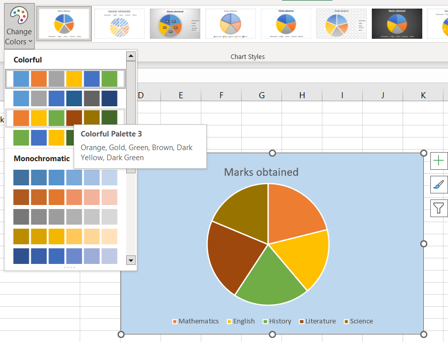
Excel comes equipped with a range of built-in color themes and palettes that make customizing your pie chart a straightforward process. You can change the colors of individual slices, adjust the entire chart’s color scheme, or even create your own custom palette. This flexibility allows you to tailor your charts to match your specific needs, whether you want a visually appealing presentation for a client meeting or a clear and informative summary for a data report.
Before venturing into custom colors, it’s helpful to familiarize yourself with Excel’s default settings. The initial color scheme of your pie chart is determined by the chart’s theme and the data series. Often, a generic rainbow spectrum is applied, which might not be the most effective for conveying your data. But fear not, Excel provides tools to easily override these default settings and create a more visually appealing representation of your data.
The Basics of Changing Pie Chart Colors
Modifying your pie chart’s colors in Excel is a fairly intuitive process. You can customize the colors using the following methods:
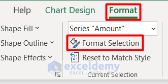
- Using the Chart Tools Tab: This tab appears when you select your chart and offers several options for customization. Go to the “Chart Tools” tab > “Format” group and click the “Fill” option.
- Right-clicking the Slice: Another easy method is right-clicking directly on the pie slice you want to change. You’ll see a pop-up menu with various options, including “Format Data Point.” Clicking on this opens a formatting pane on the right side of your screen.
- Using the Formatting Pane: The formatting pane (which pops up when you right-click on a slice or use the “Format” group in the Chart Tools tab) is a powerful tool. It allows you to change the fill color, choose from pre-defined color themes and palettes, and even customize the transparency of your slices.
Creating a Consistent Color Scheme
One of the most effective ways to analyze data is by using a consistent color scheme in your charts. This helps your audience easily grasp the relationships between different data points and trends within your chart. For example, you can use different shades of blue to represent various departments in your organization, with darker shades signifying larger departments and lighter shades representing smaller departments.
To apply a consistent color scheme, you can either choose a pre-defined color palette from Excel’s options or create your own custom palette using the “Format Data Point” option. If you opt for a custom palette, make sure to use colors that are not only visually appealing but also easy to distinguish from one another. It’s also important to ensure your chosen color scheme is accessible and works well for individuals with color blindness.

Image: www.exceldemy.com
Adding Visual Interest with Pattern and Texture
Excel’s pie chart customization isn’t limited to color. You can add subtle visual interest by using pattern fills or textures. For example, you can add subtle stripes or dots to differentiate slices or use a textured fill to give your chart a more sophisticated look. However, exercise caution as excessive patterns or textures can distract from your data. A subtle touch is usually best.
Embracing the Power of Custom Color Palettes
Excel allows you to create and save your own custom color palettes for future use. This is a fantastic feature for anyone who regularly creates charts and wants to maintain brand consistency or specific color schemes. To create a custom palette, open the “Format Data Point” pane and select the “Fill” option. Choose a color, then look for the “More Colors” button. You can then manually choose a color, use the color picker, or even input specific hex codes for precise color control.
Once you’ve created your preferred custom color palette, Excel offers a convenient way to save it for future use. In the “Format Data Point” pane, click the “More Colors” button, then select the “Customize Colors” option. This option gives you a range of options, including adding the color to your current theme or saving it to a customized palette for future projects.
Tips and Expert Advice for Stunning Pie Charts
Here are some professional tips to ensure your pie chart colors are both visually appealing and data-driven:
- Consider your audience: Think about who will be viewing your chart and what information you want to convey. Choose colors that are appropriate for the audience and the message.
- Use color contrast effectively: Ensure there is sufficient contrast between the colors of your slices so the data is easily readable.
- Limit the number of colors: Using too many colors can make your chart look cluttered and confusing. Aim for no more than 5-6 colors.
- Test your design: Print a copy of your chart and review it in different lighting environments. This helps ensure your chart remains readable in various settings.
Ultimately, the most important aspect of pie chart design is to prioritize clarity and effective communication. Remember, the purpose of a pie chart is to represent data in a visually appealing way that makes it easy for the audience to understand. Use colors thoughtfully to enhance your data, not to obscure it.
FAQ
Q: Can I apply a color scheme to multiple charts?
A: Yes, you can easily apply a color scheme to multiple charts. If you’re using a pre-defined color palette or a custom palette saved in Excel, you can simply apply it to all your charts.
Q: How can I make my chart more accessible for those with color blindness?
A: There are tools and resources that can help you test your chart against various color blindness simulations. Always opt for high-contrast colors and consider using additional visual aids like textures or patterns to differentiate slices.
Q: Can I change the colors of the chart’s title and labels?
A: Yes! You can change the font color and style of your chart titles and labels by using the formatting options available on the Chart tools tab. This allows you to create a cohesive visual aesthetic that complements your chart’s color scheme.
How To Change Pie Chart Colors In Excel
Conclusion
Mastering pie chart color customization in Excel can transform your data visualizations from dull to dazzling. With these techniques, you can create charts that are not only visually appealing but also accurately represent your data and effectively convey your message. Remember, it’s a balance of aesthetic appeal and data clarity — so choose your colors wisely and always strive to create charts that are both informative and engaging.
Are you ready to elevate your pie chart game? Share your experiences and questions in the comments below!


/GettyImages-173599369-58ad68f83df78c345b829dfc.jpg?w=740&resize=740,414&ssl=1)


