Have you ever wondered why your vibrant digital photos don’t quite translate to the same brilliance on paper? This discrepancy often boils down to the difference between color modes and how they interact with printing technology. While our eyes perceive a vast spectrum of colors on screen, the printed world operates under a more limited system, where accurate color reproduction is key. This article will delve into the intricacies of color modes, revealing the secrets behind the magic of printing.

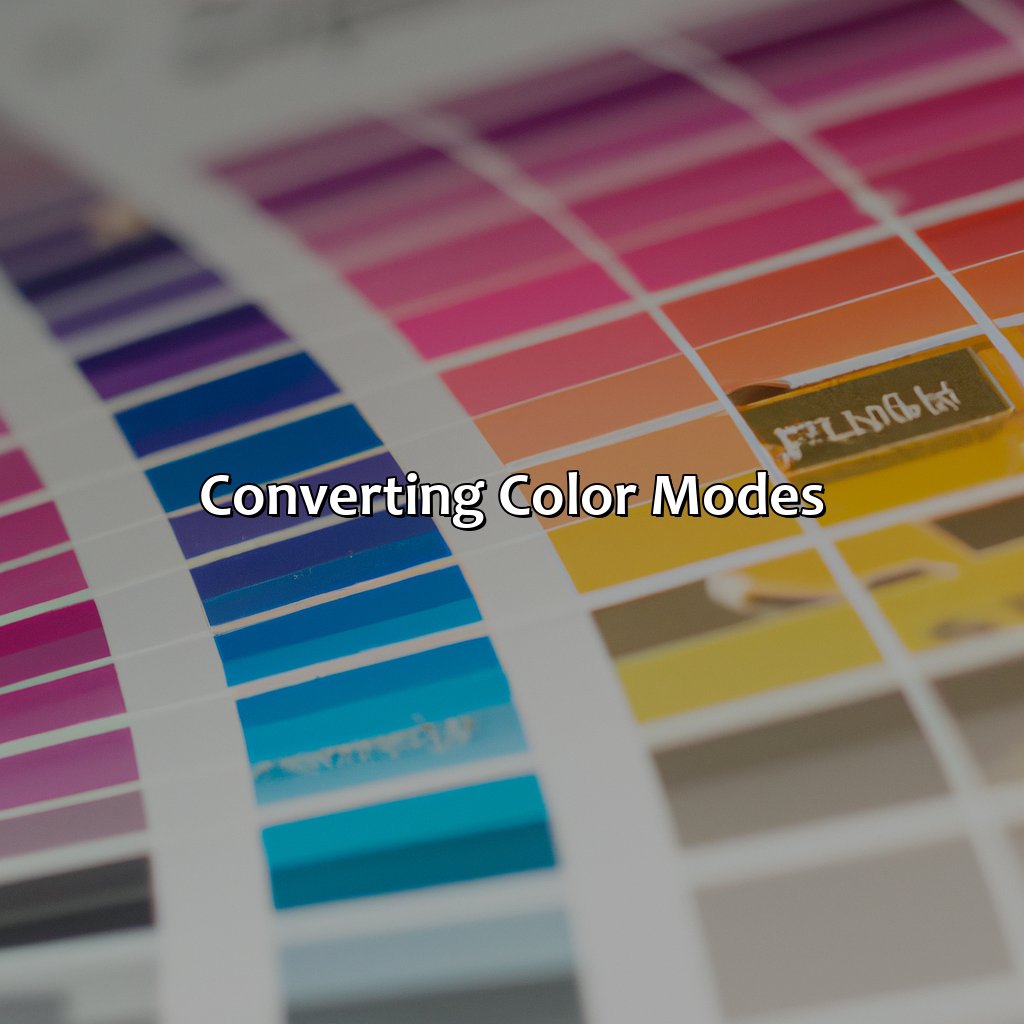
Image: colorscombo.com
Understanding color modes is essential for anyone who works with images for print, be it photographers, designers, or even casual photo enthusiasts. It’s a crucial knowledge base for ensuring colors remain consistent across different stages, from digital creation to printed reality. By exploring the world of color models and their applications in printing, we can unlock the potential for achieving visually stunning and accurate print results.
Decoding the Language of Color: RGB vs. CMYK
The digital realm speaks in the language of RGB (Red, Green, Blue), a color model that uses the combination of these three primary colors to generate an expansive palette. Each color is represented by a value between 0 and 255, with 0 being the absence of that color and 255 representing its saturation. This additive color model, where light is added to create color, is ideal for displays and digital media.
However, when it comes to printing, a different color model comes into play – CMYK (Cyan, Magenta, Yellow, and Key/Black). This subtractive color model works by subtracting light from white to create various colors. Each color in CMYK is represented as a percentage, indicating the amount of each ink to be applied. This model is inherently different from RGB, and it’s crucial to understand the nuances of each to achieve consistent color reproduction.
The Bridge Between Digital and Print
The transition from RGB to CMYK is a pivotal step in the printing process. While RGB excels in screen displays, it’s not directly compatible with the subtractive process of printing inks. Converting from RGB to CMYK involves a complex transformation that aims to preserve the original color intent as closely as possible. This conversion is typically done through software specifically designed for color management.
Understanding the intrinsic limitations of CMYK is crucial in achieving accurate print results. CMYK cannot reproduce the full range of colors in the RGB spectrum, especially vivid greens, blues, and purples. This is partly why vibrant digital images may appear slightly muted when printed. However, advancements in printing technology and inks are continually pushing the boundaries of CMYK, allowing for more vibrant and accurate color reproduction.
Color Management: The Key to Print Perfection
Color management is the backbone of achieving faithful color reproduction across different devices and processes. It involves calibrating monitors, creating color profiles for printers, and converting color spaces effectively. The goal is to ensure that colors appear as intended, regardless of whether they’re viewed on a screen or printed on paper.
For accurate color management, it’s essential to use a high-quality color profile that accurately represents the specific printer and paper being used. These profiles contain information about the color gamut and characteristics of the printing process, helping to ensure that the conversion from RGB to CMYK results in the most faithful color representation.

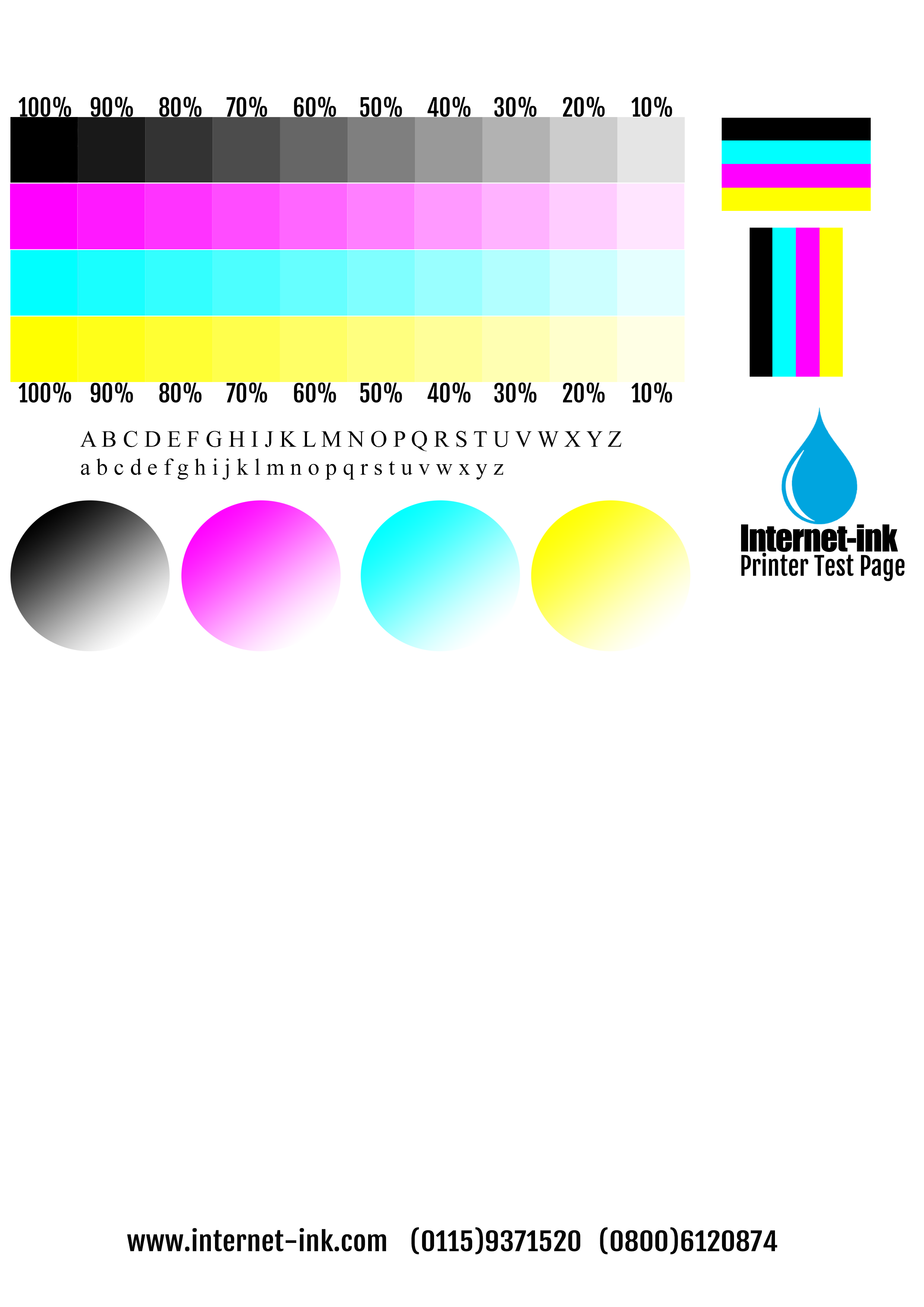
Image: mavink.com
The Impact of Paper: A Key Partner in Color Reproduction
The type of paper plays a vital role in influencing final print color appearance. Paper can be coated or uncoated, thick or thin, white or tinted, and each option affects how ink is absorbed and reflected. Matte papers, for example, absorb more ink, creating a richer, less reflective finish, while glossy papers reflect more light, resulting in a brighter, more vibrant appearance.
When selecting paper, it’s important to consider the color profile and the intended purpose of the print. For artwork or photography, high-quality paper with a specific color profile can make a dramatic difference in the final result. By understanding the nuances of paper selection, designers and photographers can fine-tune their prints to achieve their desired aesthetic.
Beyond CMYK: Specialized Printing Techniques
While CMYK is the standard for most printing, specialized techniques like spot colors offer greater control over specific colors, like corporate branding or intricate patterns. Spot colors, defined by unique ink formulations, provide precise and consistent color reproduction, especially for projects requiring high color fidelity or specific brand colors.
Other printing technologies, such as digital printing, allow for a broader color gamut than traditional offset printing, often exceeding the limitations of CMYK. These advances offer new possibilities for color reproduction, allowing for greater accuracy and vibrancy in printed images.
The Future of Color Reproduction
The world of color reproduction is constantly evolving with advancements in printing technology and ink formulations. New techniques, such as digital printing with wider color gamuts and the development of new inks, are pushing the boundaries of color fidelity.
As technology continues to advance, we can expect even greater accuracy and a more seamless integration between digital and printed color. The pursuit of perfect color reproduction is a journey of ongoing innovation, and understanding the dynamics of color modes is essential for anyone who wants to achieve stunning, true-to-life printed results.
What Color Mode Is Used For Printing
Conclusion: Embracing the Complexity of Color
The world of color modes is a complex and fascinating landscape. Understanding the differences between RGB and CMYK, the importance of color management, and the impact of paper and printing technology allows us to achieve impactful and accurate printed results. As we continue to explore the intricacies of color reproduction, we unlock the potential for greater precision and visual beauty in the printed world.


/GettyImages-173599369-58ad68f83df78c345b829dfc.jpg?w=740&resize=740,414&ssl=1)


